How Yogile doubled its conversion rate after discovering the Aha-moment and redesigning their user journey
Discovering the Aha-Moment
First step was runnining the Aha-Moment. This report, runs a few analyses simultaneously to discover the moment when users finally gain value from an app or website.
When you know what this special moment is, you can create a better onboarding experience that will increase user retention and conversion rates.
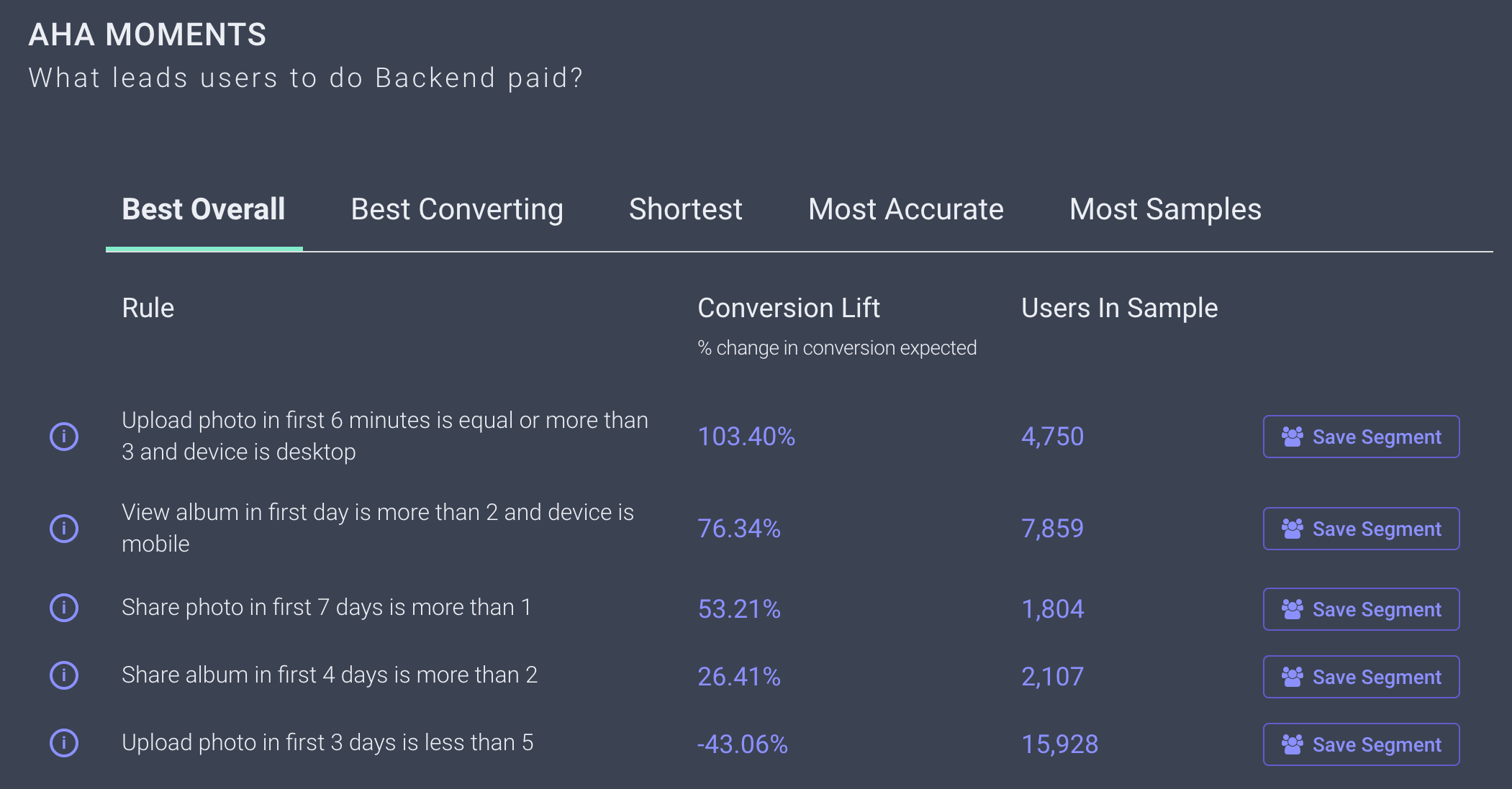
Stormly discovered that the most likely conversion segment were users who uploaded at least three photos within six minutes of usage. Stormly found out that desktop users are more likely to upload than mobile users.
Re-desiging user journey
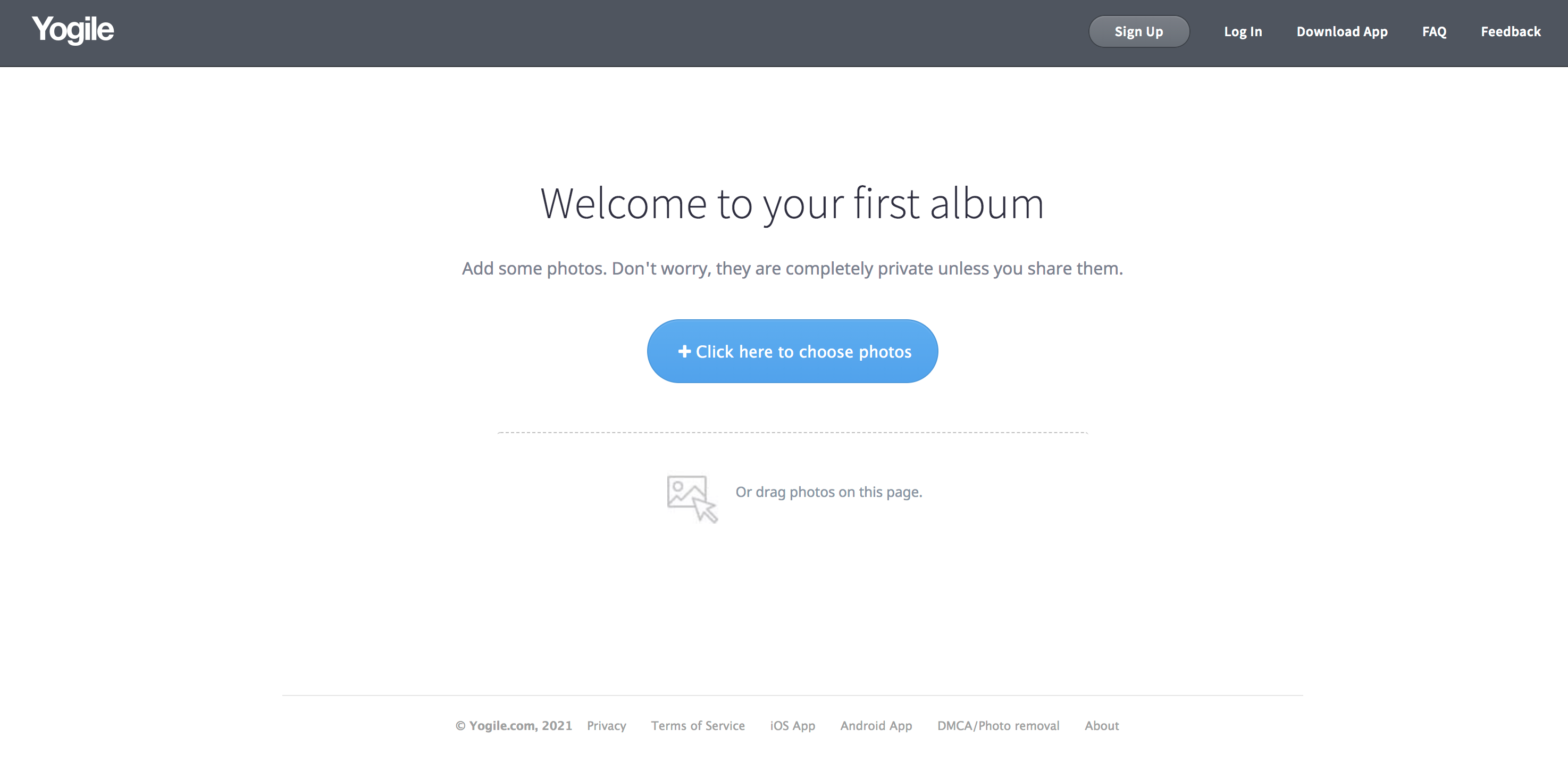
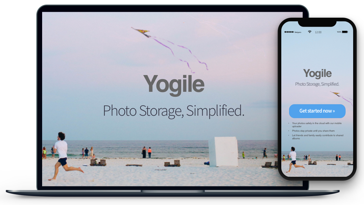
Basing on that insight, Yogile redesigned their sign up process to be more user-friendly. The old layout required the user to enter in an email address before getting started with adding photos.
Yogile has changed this so now users click on "Get Started" and are immediately taken into the "Add Photos" page without any additional steps needed.
A/B testing
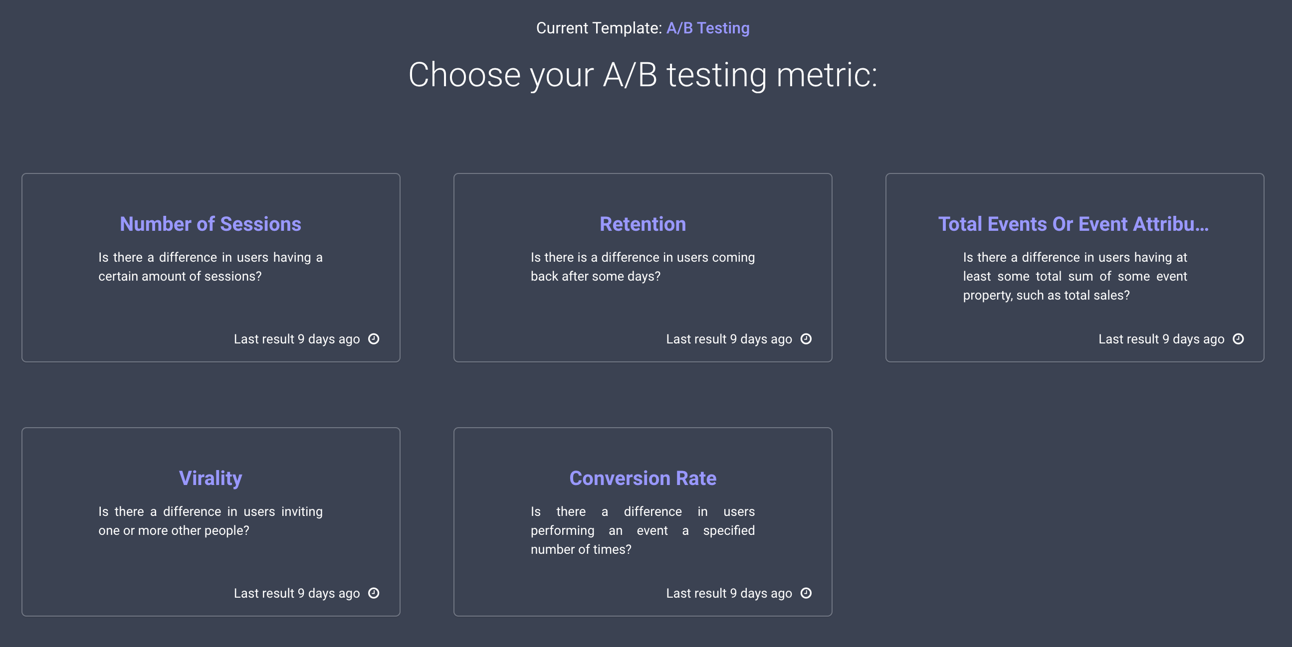
With Stormly’s A/B testing, you can test your product on everything from conversions to retention rates to viral coefficients.
That report will even do all the work for you by determining sample size and how many days an experiment should run for before it decides who the winner is!
Like in case of Aha- Moment, we chose the goal: Conversion to Payment. It is also possible to choose other goals, like Retention or Virality.
Forecasting
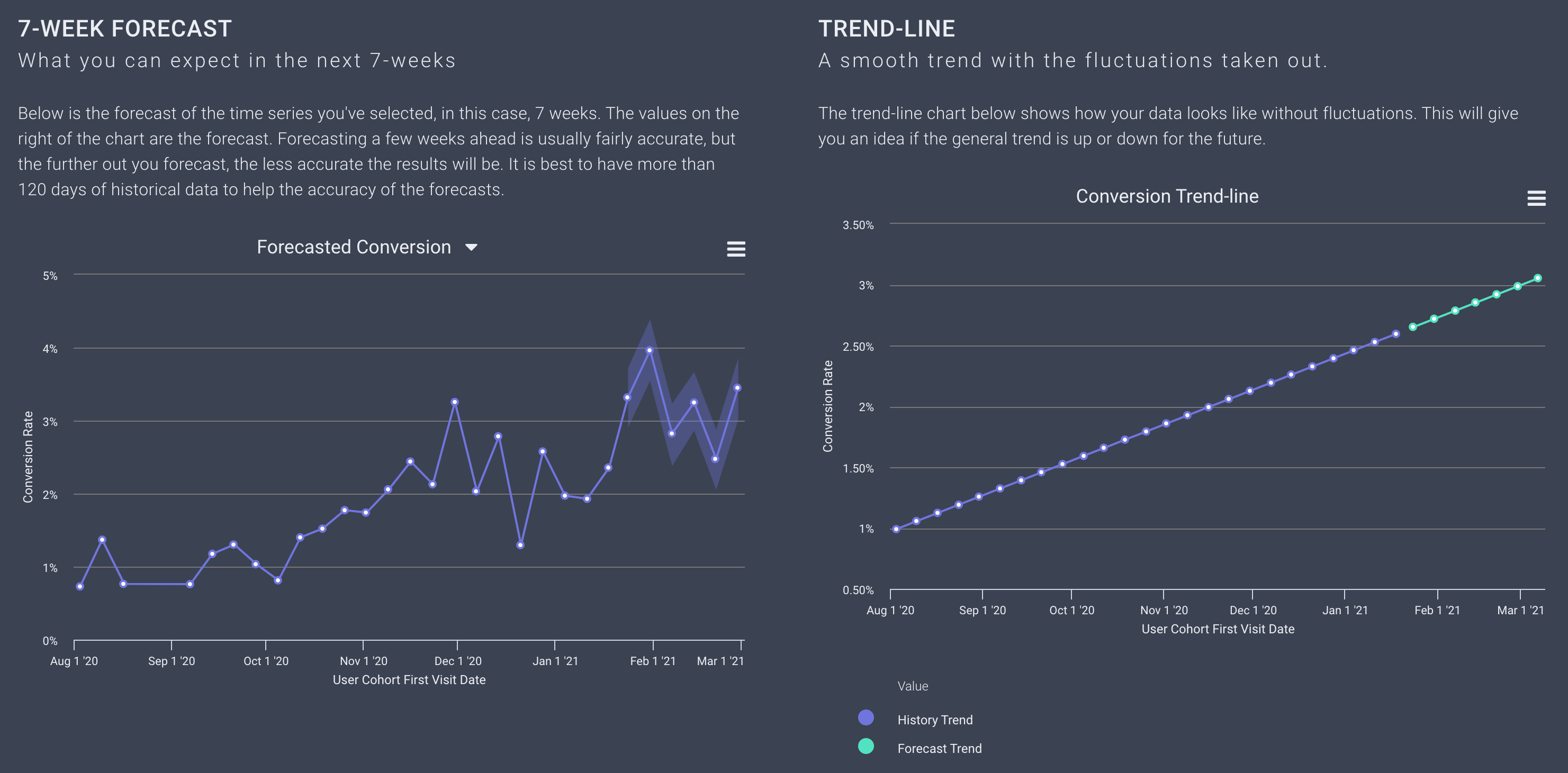
The last step is implementation and forecasting. We will use the Forecasting report for that.
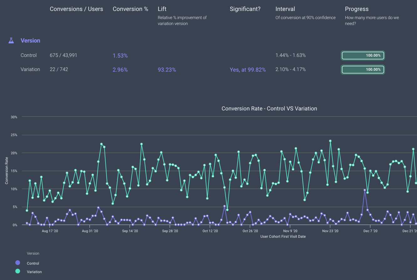
We made it! With the change, conversion doubled and Yogile is now able to test out different templates. The future is looking bright for this company as they continue to improve their product, engagement rates, and metrics.
Sign up now and you'll be on your way to a conversion rate that blows away the competition 🤯
Try For Free